
What’s better than a page full of numbers? A page full of numbers put into a graph! Graphs help you see how numbers relate to each other and make different assumptions or conclusions. However, there isn’t just one type of graph used in math. Take a look at a few major types of graphs you’ll find.
What Is a Graph?
Math and numbers can be hard to understand, especially if you have a lot of data you are comparing. However, a graph can make it easier. Why? Because a graph is data or numbers put into an easy-to-follow picture. And depending on the type of numbers you are working on graphing; you might need a different type of graph for each. For example, if you were comparing different color shirts in your classroom, you might use a bar graph or pie chart. However, if you want to connect numbers in a line, you might use a line graph.
Graphs vs. Charts
While you might hear chart and graph used interchangeably, these two terms are not exactly the same. Graphs are types of charts. Charts are a way to present information graphically, including graphs, diagrams, tables, and other visual representations of data. So while all graphs are charts, not all charts are graphs. Since that’s confusing, it might be easier to remember that visual representations of math relationships are found in graphs.
Different Types of Graphs in Math
Now that you have an idea of what graphs are, it’s time to dive right into the meat and potatoes by looking at the type of graphs.
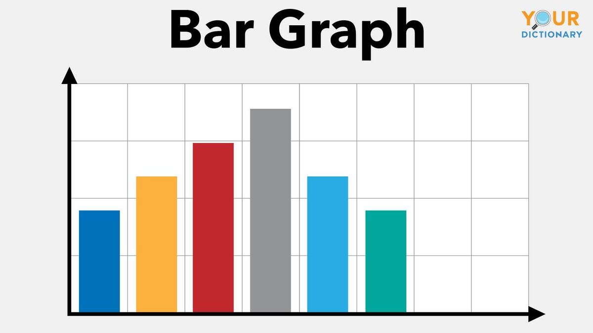
1. Bar Graph
A bar graph shows numbers and statistics using bars. These might be bars that go up or bars that go to the right. This type of graph works perfectly to show size relationships, frequencies and measurements. For example, you could use a bar graph to find out how many people in your classroom have a specific type of car.
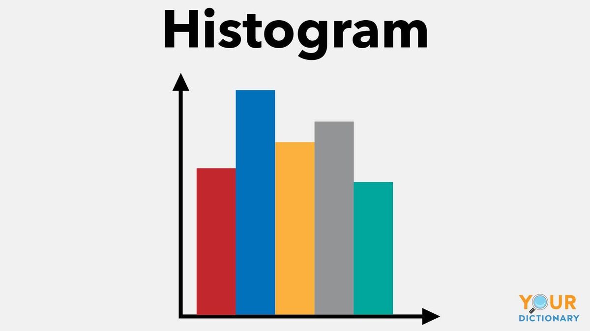
2. Histogram Graph
A histogram is quite similar to a bar graph; however, this graph is designed for statistical information that falls in ranges. For example, you could use it to graph the ranges of the height of people in a classroom or house. So, you might have 5 people from the range of 5 feet to 5 feet 5 inches. You can tell the difference between a bar graph and a histogram because a histogram has no space between the bars.
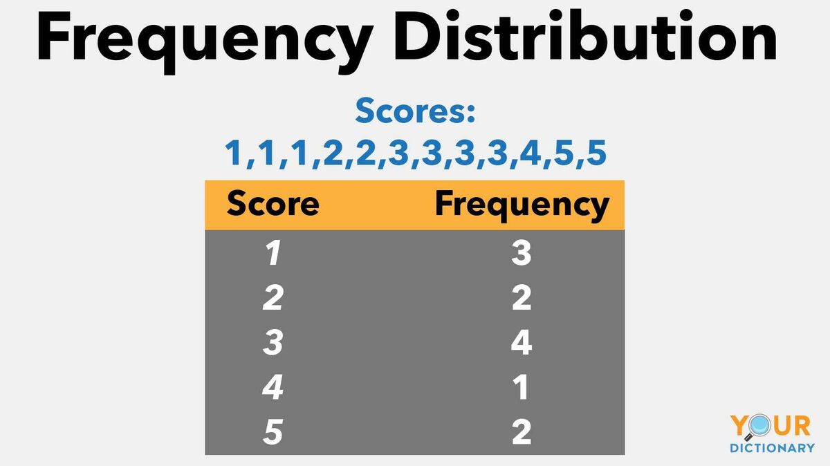
3. Frequency Distribution
When it comes to a frequency distribution graph, also called a frequency distribution data set, it tells you the number of times something occurred. For example, it could tell you what percent of people in your school like chocolate cake, pie or cookies.
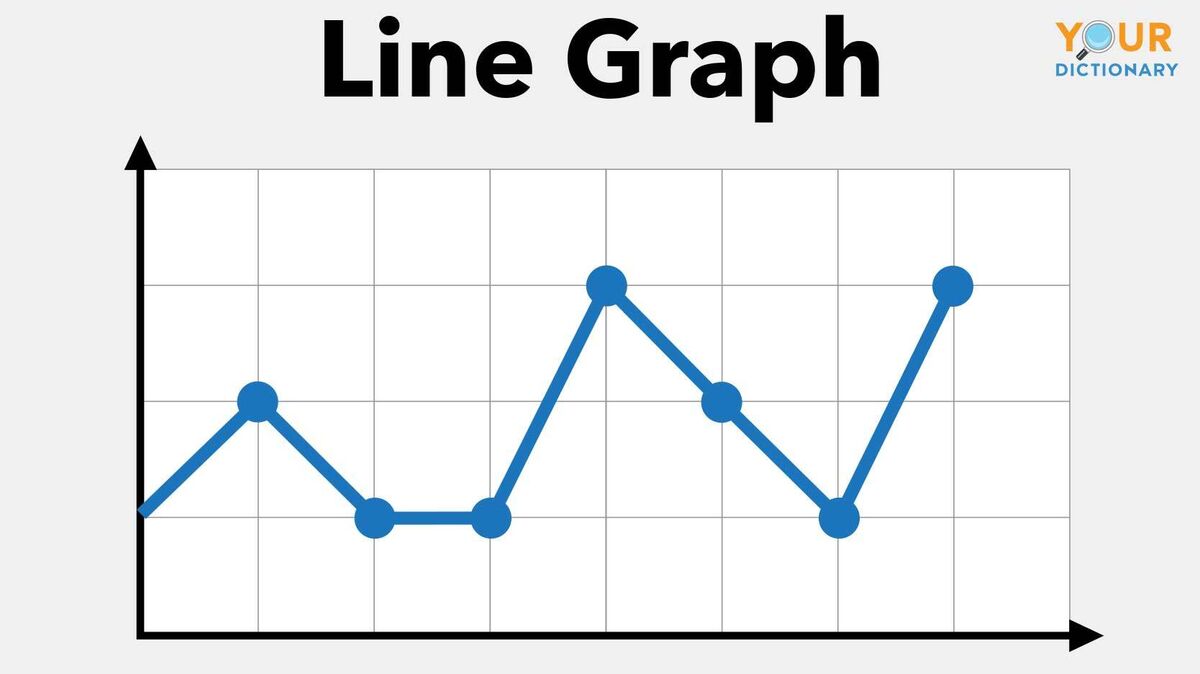
4. Line Graphs
When it comes to a line graph, think of the word line. Line graphs are data points that are put on a graph and connected to create a line. As an example, you could look at the change in the cost of lunches from 1980 to 2020 in a line graph.
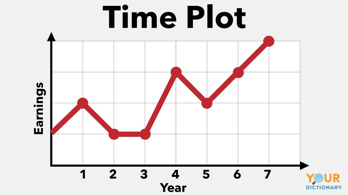
5. Time Plot
Time can always be measured. And when it is, you can call that a time plot graph. This type of math graph has time on the x-axis. The y-axis will then measure something else. So you could create a graph of distance vs. time on a time plot graph.
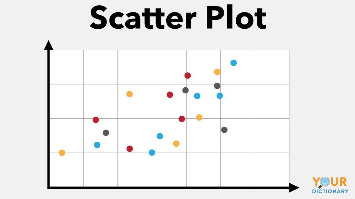
6. Scatter Plot
You might have started to notice that graph names typically come from what they look like. This is true for a scatter plot graph. This type of graph has points scattered on a graph. However, if you look at these points, you can see trends and relationships between the two units being measured.
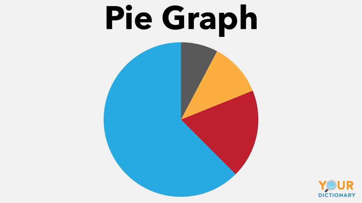
7. Pie Graph
What kind of graph looks like a pie and has slices? Well, a pie graph, of course. Pie graphs are versatile graphs that can show relationships between several different variables. With a pie graph, you could graph what percentage of your family likes comedy, sci-fi, drama or action movies. The pie graph shows you the percent they like the most and those they like the least.
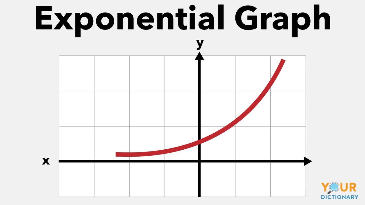
8. Exponential Graphs
In algebra, you start to use a lot of different exponents and expressions. These expressions can be graphed using the x-axis and y-axis on an exponential graph. For example, y = 2x creates a curved line on the graph that moves up toward the right.
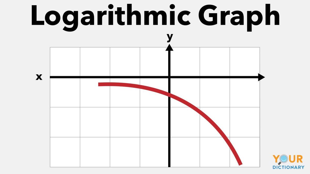
9. Logarithmic Graphs
If you know how to create an exponential graph, it's also important to know how to create a logarithmic graph. Why? Because the logarithmic function is basically a mirror image of an exponential function. Mathy-type people call it the inverse function. So the inverse of our exponential function would be y = log2x.
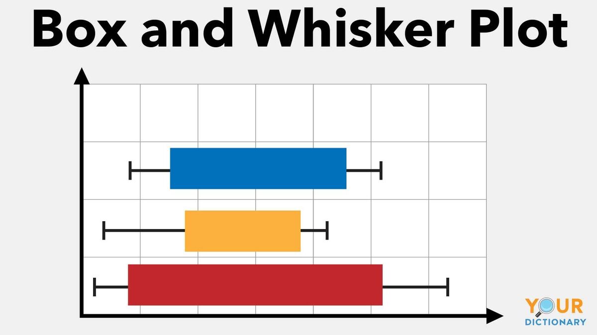
10. Box and Whisker Plots
You might have heard of the median in math. If you have, you know it has upper and lower data extremes. So to graph that information, you use a box and whisker plot or a box plot. This graph looks like a box with little whiskers coming out of it. The whiskers show the extremes while the box shows the median.
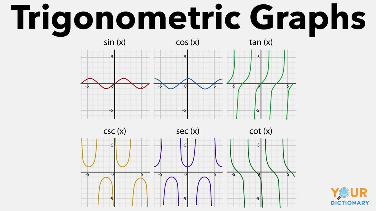
11. Trigonometric Graphs
When you get to the level of trigonometry, you have to create graphs for sine, cosine, tangent, cotangent, secant and cosecant. Each of these graphs has a distinct look due to the way the functions are calculated.
Know the Types of Graphs in Math
Math is full of numbers. And a lot of times, those numbers need to be graphed for a person to truly understand them. However, not every graph works for every number, equation or expression. Therefore, you’ll find that you use a lot of different graphs in math. And now you know 11 major ones. It’s time to enjoy the types of lines in geometry.